Nutrition App
Role
Final Project for UX Design at Brainstation | 2019
The (Fictional) Problem
There were multiple problems to choose from. I decided to research and design a nutrition app that focused on food intake.
- Problem - People wanted to know the nutritional value of the food they ate.
- Target Audience - Individuals who are looking to track their nutrition intake.
- How Might We - Develop a tool that provides accurate, detailed, and personalized information on the nutritional content of food items.
- Outcome - To ensure they can easily and accurately track the nutritional content of food items. To ensure that the information is relevant to their goals/purposes of using the app.
Research
Before conducting research, my hypothesis was that a nutrition app that lets users set goals based on their needs, the ability scan for food by scanning a barcode or taking a photo of it, recording their intake and displaying their daily nutritional count will improve the experience of tracking nutrition info based on an individual's health goals.
Interviews were conducted with people of different levels of nutrition and fitness interests. Some insights include behaviours such as already knowing how to read nutrition labels, pain points such as not knowing the nutrition of meals when eating out, and goals such as wanting to know the nutrition of food to help weight loss or manage their diabetes.
The findings validated my hypothesis. Allowing users to set goals not only for calories but for other nutritional value will benefit those who have different health goals in mind. A daily nutritional counter will allow users to see how much they can eat or have already consumed based on their set goals. Giving multiple options to find nutritional info of the food they are eating such as keyword search, scanning the barcode or taking photos of their food will reduce friction when looking for or recording their intake.
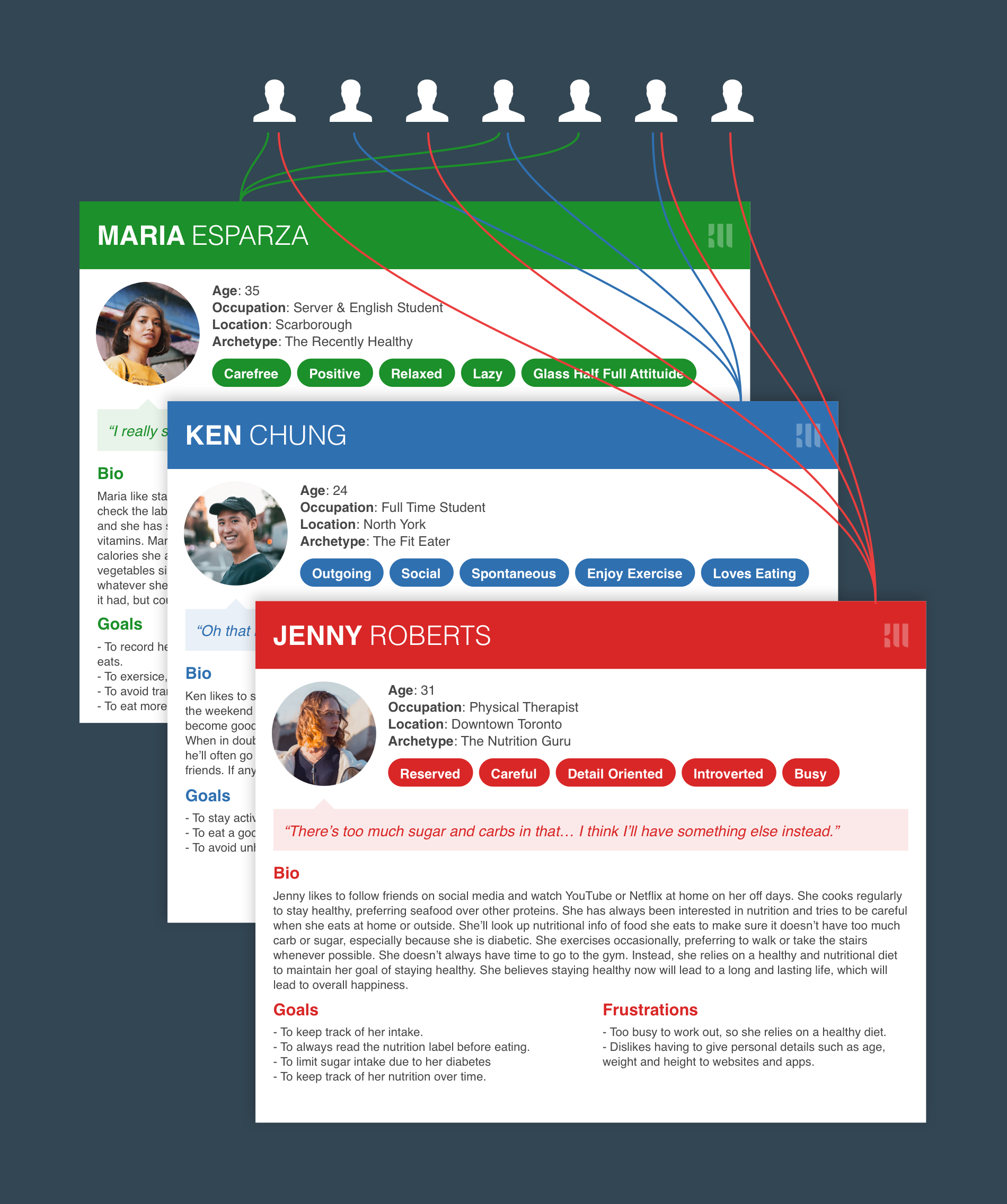
Findings were synthesized into user personas.
Information Architecture
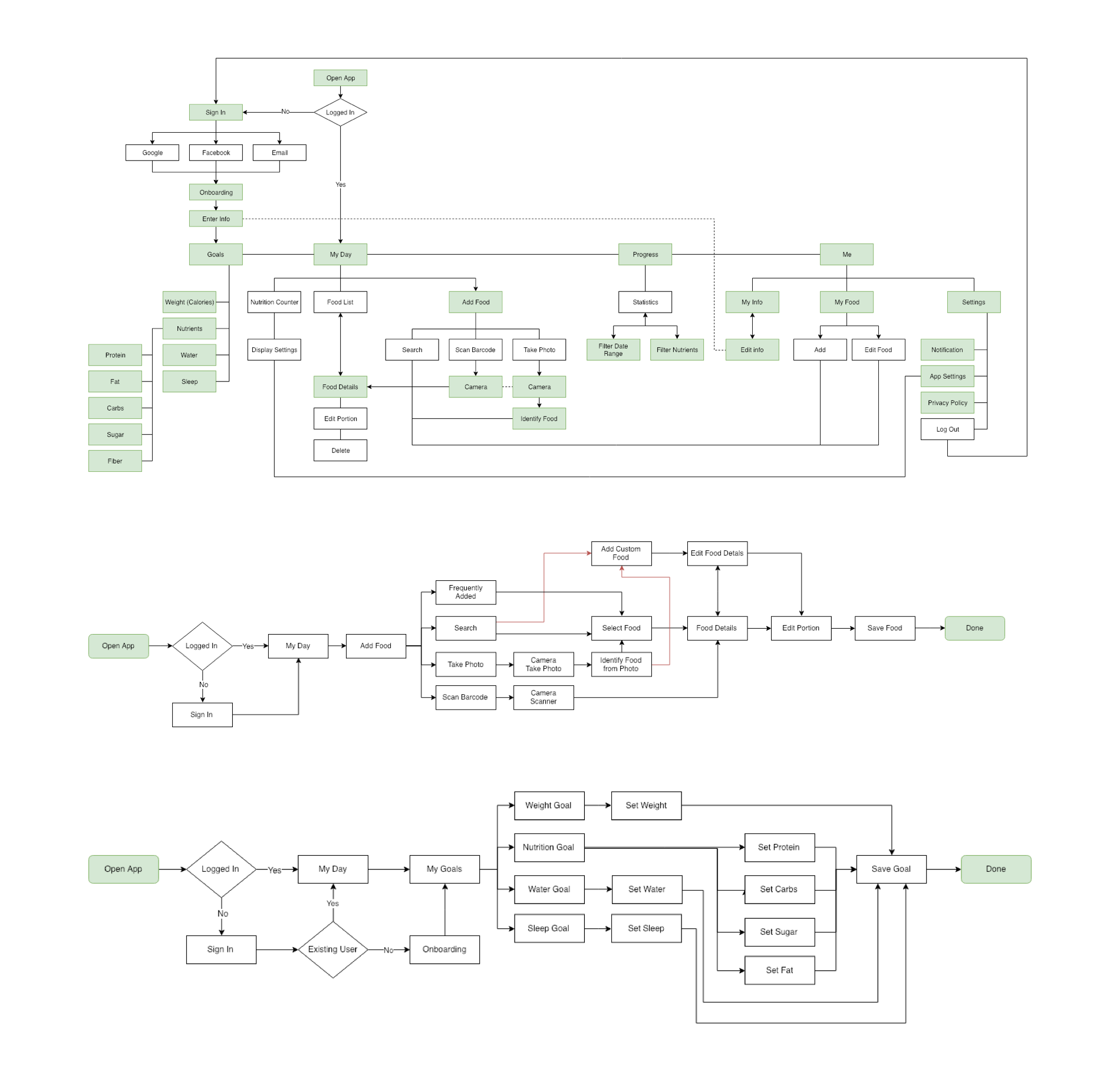
From the personas, I mapped out the information architecture by creating sitemaps and user flows to complete two specific tasks. 1) Adding a goal based on their needs, such as losing weight or counting intakes like sugar and carbs. 2) Adding food eaten by searching for it or taking a photo of it.
Prototyping & User Testing
The flows were sketched out and turned into a wireframe prototype using Sketch & InVision. With a clickable prototype, user tests were conducted with participants, including some of those who were interviewed. Various iterations were made to improve the design and interaction based on testing.
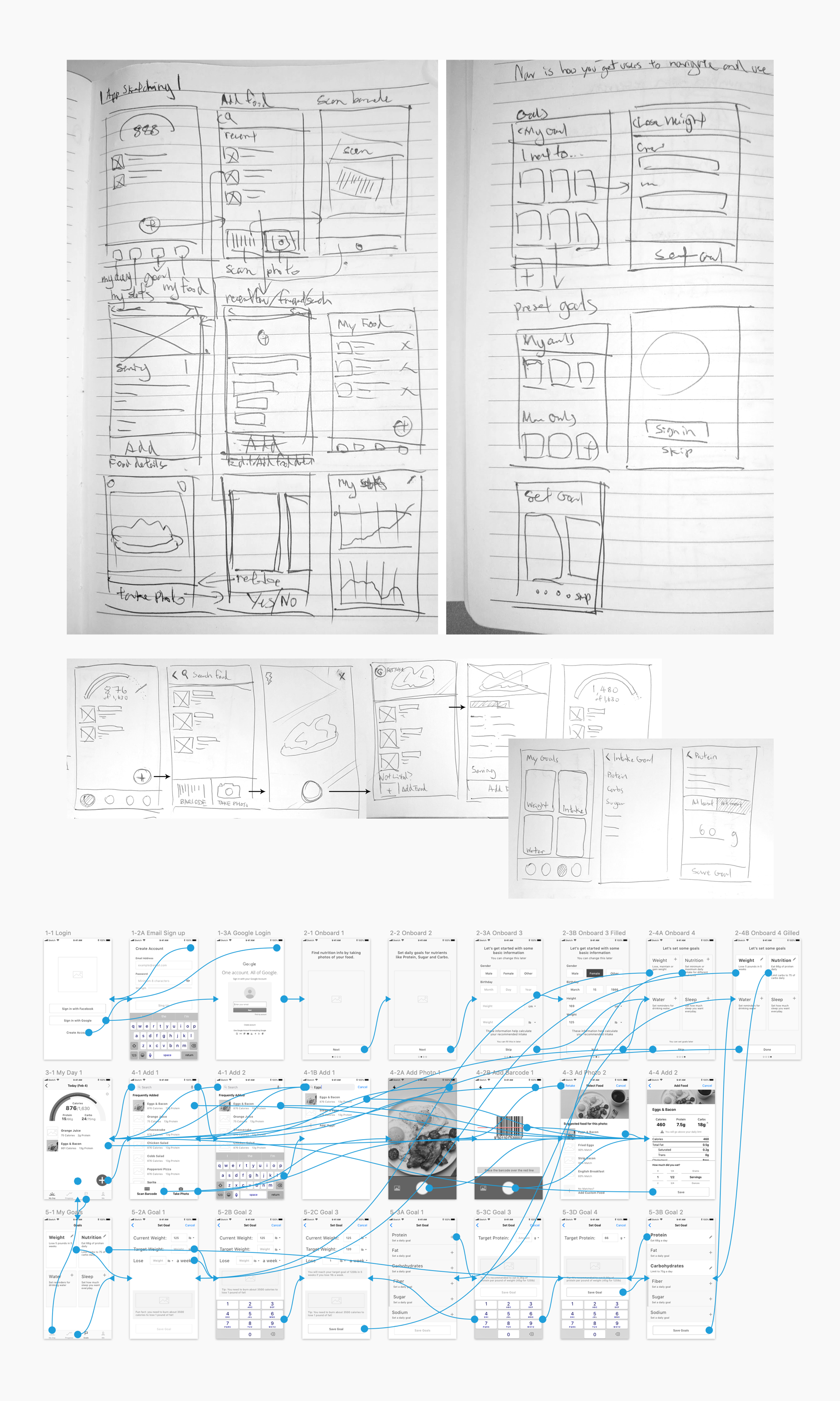
Some leanings from testing:
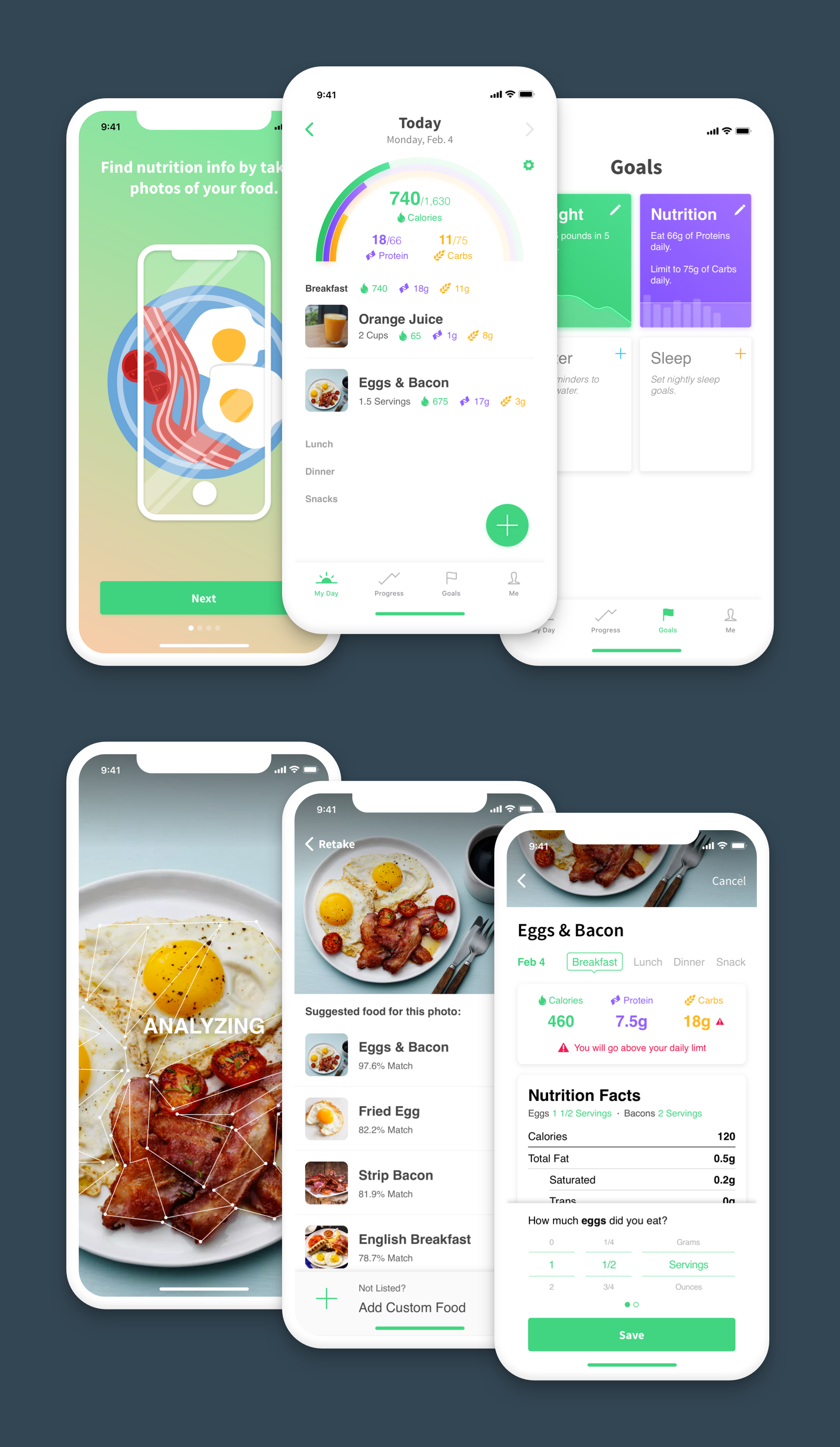
Goals: The goal screen allowed users to set goals such as calories, nutrients, sleep and water intake. Participants understood the goal screens, but some could not distinguish active and inactive goals. Visuals were added to make it more obvious. Some wanted to set other goals such as exercise but additional research would be needed to better understand user needs.
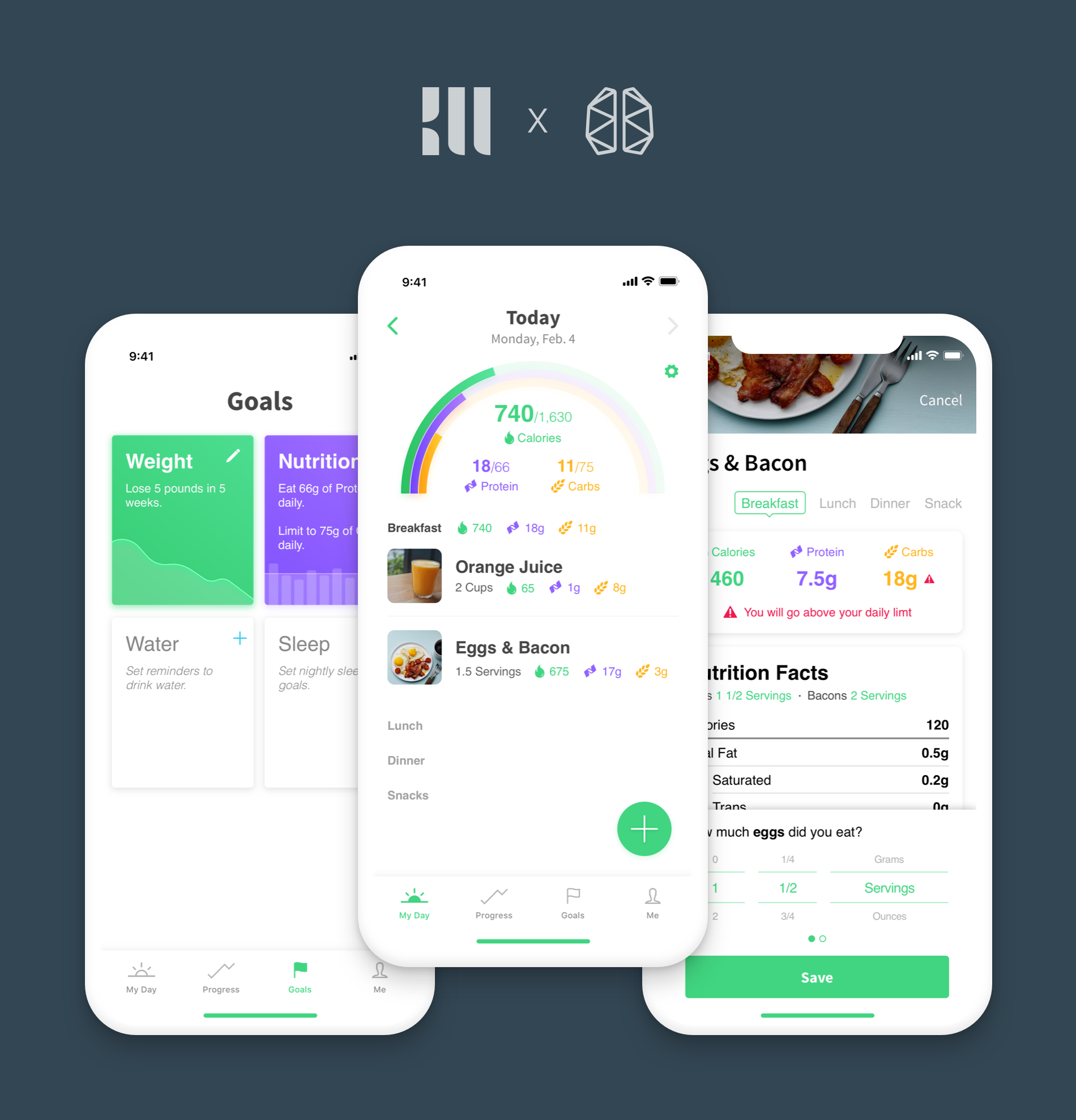
My Day: This is the main screen of the app which shows a counter of the day’s nutritional intake. Participants were asked to add food by search, photo and scanning a barcode. Surprisingly, all participants succeeded in this task.
Select Food: After taking a photo, this screen shows the possible food items. As a contrast to the previous screen, only one of the participants immediately understood this screen. Users did not realize they needed to select the proper food item and would often tap on “Add Food” which would add a new custom food. The design was tweaked to improve the experience. Match percentage was added to differentiate results from regular food listings, copy was added to better explain the screen, and the Add Custom button was moved to the bottom to separate it from the food list. This helped people understand the screen better.
Add Food: This screen shows the nutrition info and a portion selector to add the food to their day. It displayed key nutrients based on the user’s goals and nutrition label which many were familiar with. Indication for going above a specific limit was met with positive reaction. Most participants understood this screen, but due to the limitation of prototypes, they could not scroll the screen or selector which was met with some frustration. However, it was a positive sign that they know to scroll.
Visual Design
After testing, some screens were polished into high fidelity mockups.
Learning Outcomes
I took this program to better understand user experience and to further my career as a product designer. I wanted to focused on the research and testing aspect and learned two key ideas:
- Early and upfront research with the right demographic is key to gaining valuable tangible insights that can validate and steer design hypothesis into a more empathic direction.
- Testing early, even with sketches, and throughout the design process can reveal flaws and expectations that may not have been evident while designing the user experience.
What's Next
After my time at BrainStation, I joined Motoinsight to design an omni-channel digital retailing platform to help customers buy a car online without the stress of dealerships. I was eventually made the design lead of the consumer product and learned a great deal, especially about the importance of data in shaping and optimizing experiences.