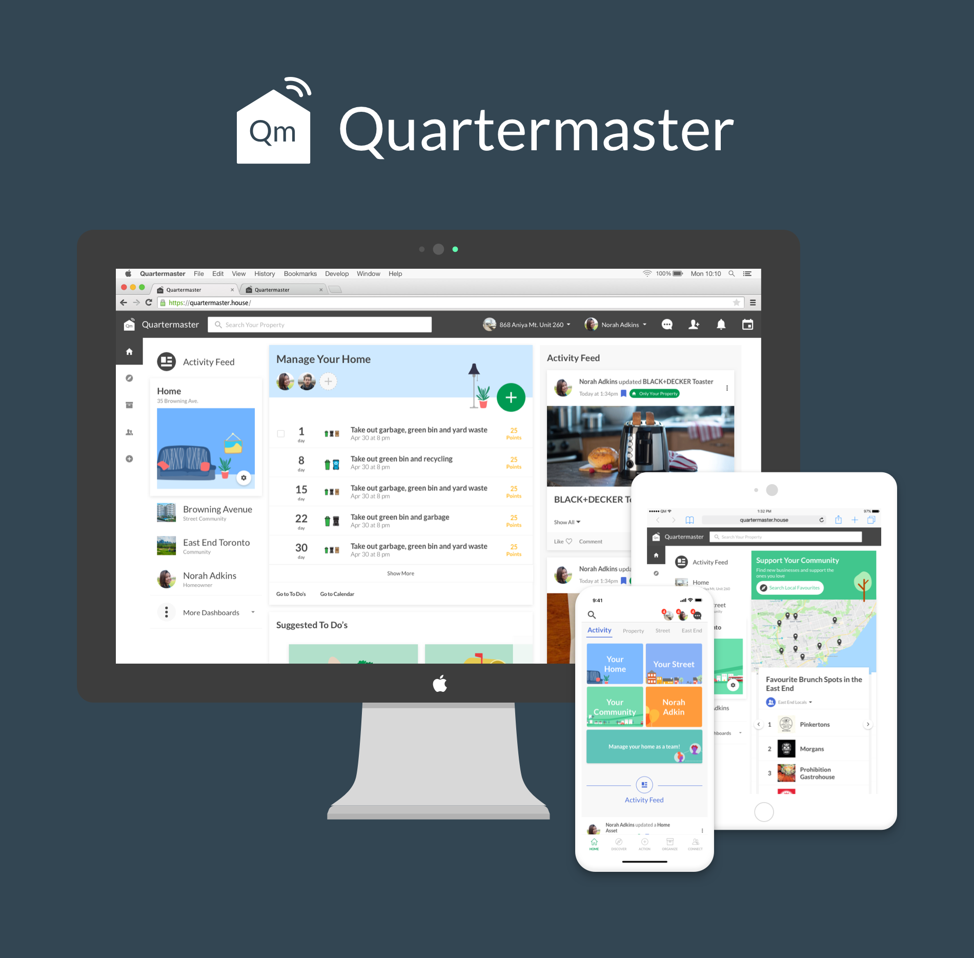
Quartermaster
Role
UI/UX Designer at Quartermaster Inc. | 2016 - 2018
Overview
Get rewarded for being organized. Quartermaster is an ambitious platform rewarding homeowners for organizing their home and contributing to their local community.
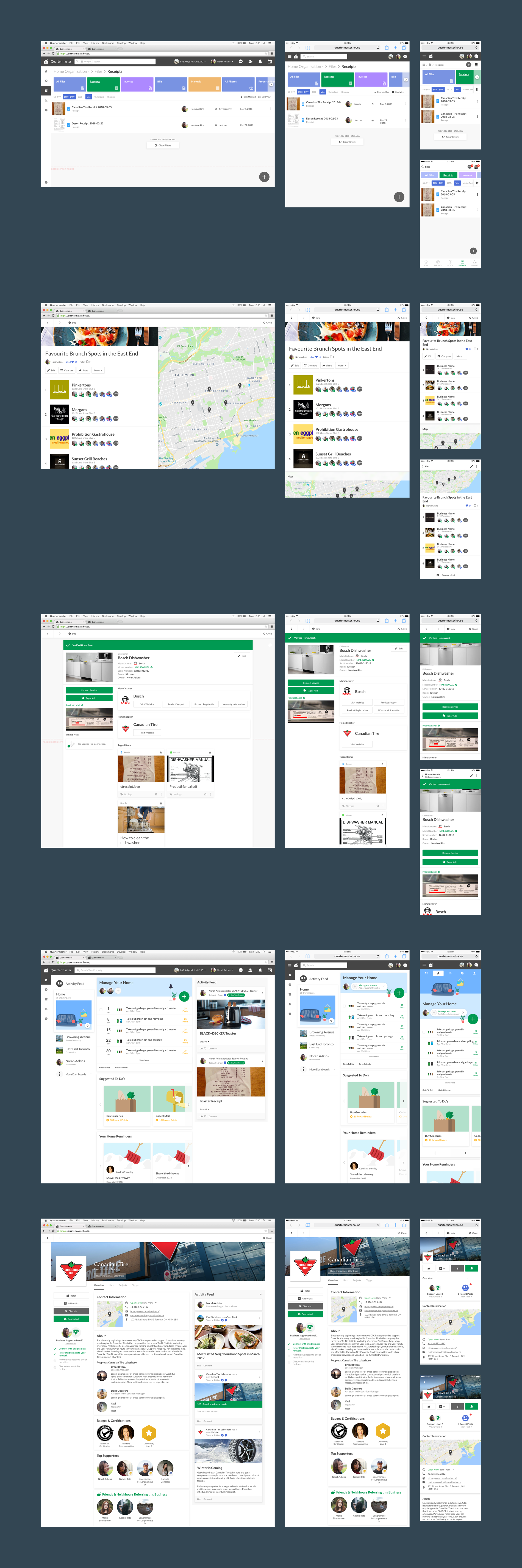
Quartermaster began as a home organizational platform where users can digitize their home appliances such as fridges and furnaces. We called these Home Assets. By successfully adding a home asset with its receipt, model number and serial number, homeowners could access importation information such as manuals, warranty information, and qualified serviceres. Reminders were automatically added based on the home assets they add, such as “replace the furnace filter” or “change the smoke alarm batteries”. Quartermaster also reminded homeowners to take out their garbage based on the collection schedule of their address.
In addition to home organization features, another major aspect of Quartermaster was the local and neighbourhood networking and referral systems. The Discovery feature allows homeowners to find professionals such as plumbers and electricians or local spots like cafes and restaurants, all powered by friends and neighbours recommendations called Referrals, which was a major currency on Quartermaster. Since referrals come from direct friends and neighbours, the goal was to make referrals on Quartermaster genuine and trustworthy.
Challenges
Quartermaster went against the traditional model of startups by trying to go for a complete experience upon launch instead of starting with an MVP. There were many challenges with this approach, including the lack of data and validation process without a foundation of users.
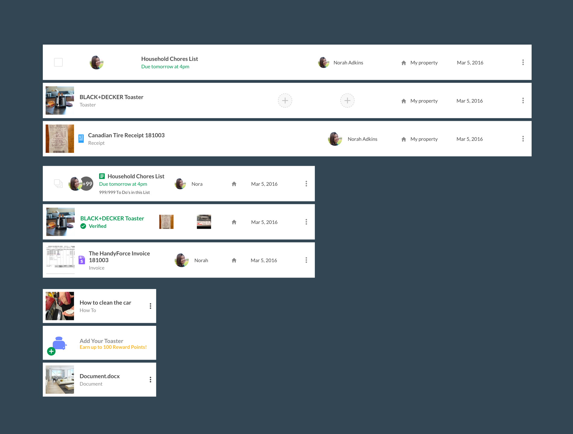
Quartermaster boasts a large number of features including adding home assets, storing documents and receipts, creating notes and how-to’s, managing home projects, organizing tasks and to do lists, household management, calendars, instant messaging, discovering and connecting with businesses, finding and sending referrals, neighborhood communities, activity feed, user posts and sharing, reward points, list creation, user badges and levels, and a business app that mirrored many of the features plus editing and management features.
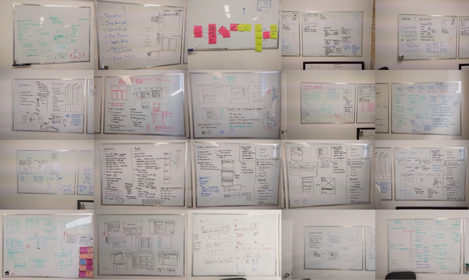
Many features had mature standalone products in its space. We reviewed these competitors to ensure the minimum features we needed to remain competitive. Once the features were laid out, we would whiteboard, create sketches, do card sorting, and draw user flows to begin the design process.
Navigation
With so many features and sections, IA and navigation were an ongoing challenge. One particular challenge was the company’s philosophy of “buckets”. Buckets were essentially groupings of similar contents, similar to categories. For example, the Connection section had categories such as Professionals, Home Suppliers, Neighbourhood Spots, Friends and Home Connections. These were all connections but with different categories.
The idea was that buckets introduced a layer of organization akin to organizing your drawers and labelling it. This type of organization is indeed beneficial in the real world where objects take up physical space and there is no real life search and filter which are ubiquitous on digital platforms. So items need to be organized into containers like drawers, desks, cabinets and such. However, content is king on digital platforms, where anything can be searched and filtered almost instantly. This means the buckets added an extra layer of navigation between users and their data. Many of the early design centered around this bucketing philosophy.
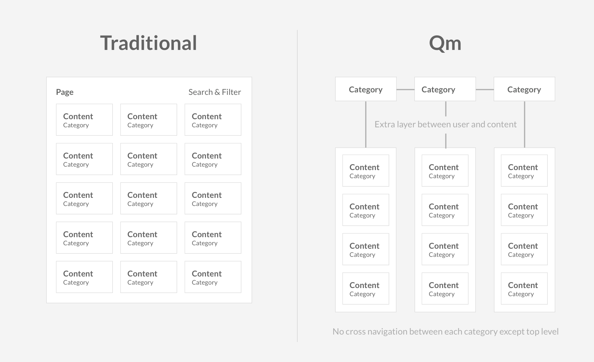
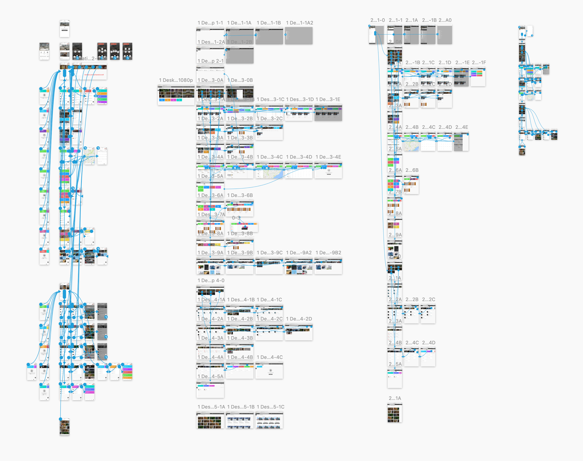
Testing and feedback revealed that this was indeed an issue. Users had a hard time navigating and finding their content. We tried several solutions to overcome this issue. First, a top tier search was added allowing homeowners to search anything on their account, then expanding to any public item on the platform. Second, dashboards replaced the category pages. The dashboard summarized the user’s contents and gave suggestions on what to do next, allowing quicker access to users’ files and increased engagement in some cases. Third, an activity feed was added along with the dashboard. This allowed homeowners to access recently added or edited items more easily. Lastly, all similar objects were aggregated into a single page allowing users to drill down with search, filters or categories. This was the direction I wanted to take early on while designing the navigation.
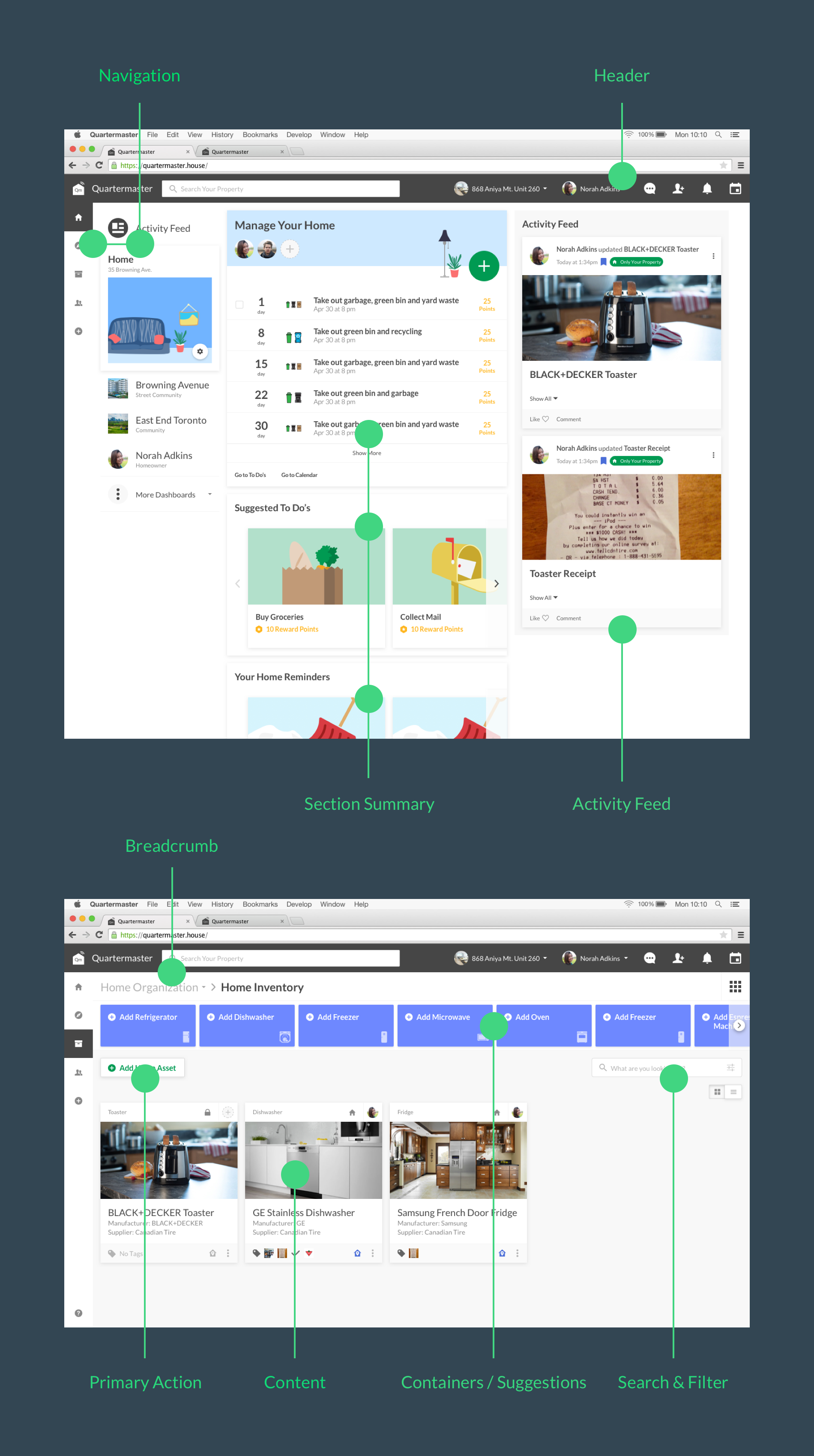
The deeper navigation structures were also polished. Each object type on quartermaster had a different purpose but needed to be displayed in an organized matter. A consistent navigational experience was designed so users are able to navigate the content no matter which section they were in. This structure included the primary navigation on the left, breadcrumb at the top, containers below the breadcrumb, and infinite scroll of objects at the bottom. Sorting, search and filter, and view toggles were added to each section to allow users to customize their views.
Card & List View
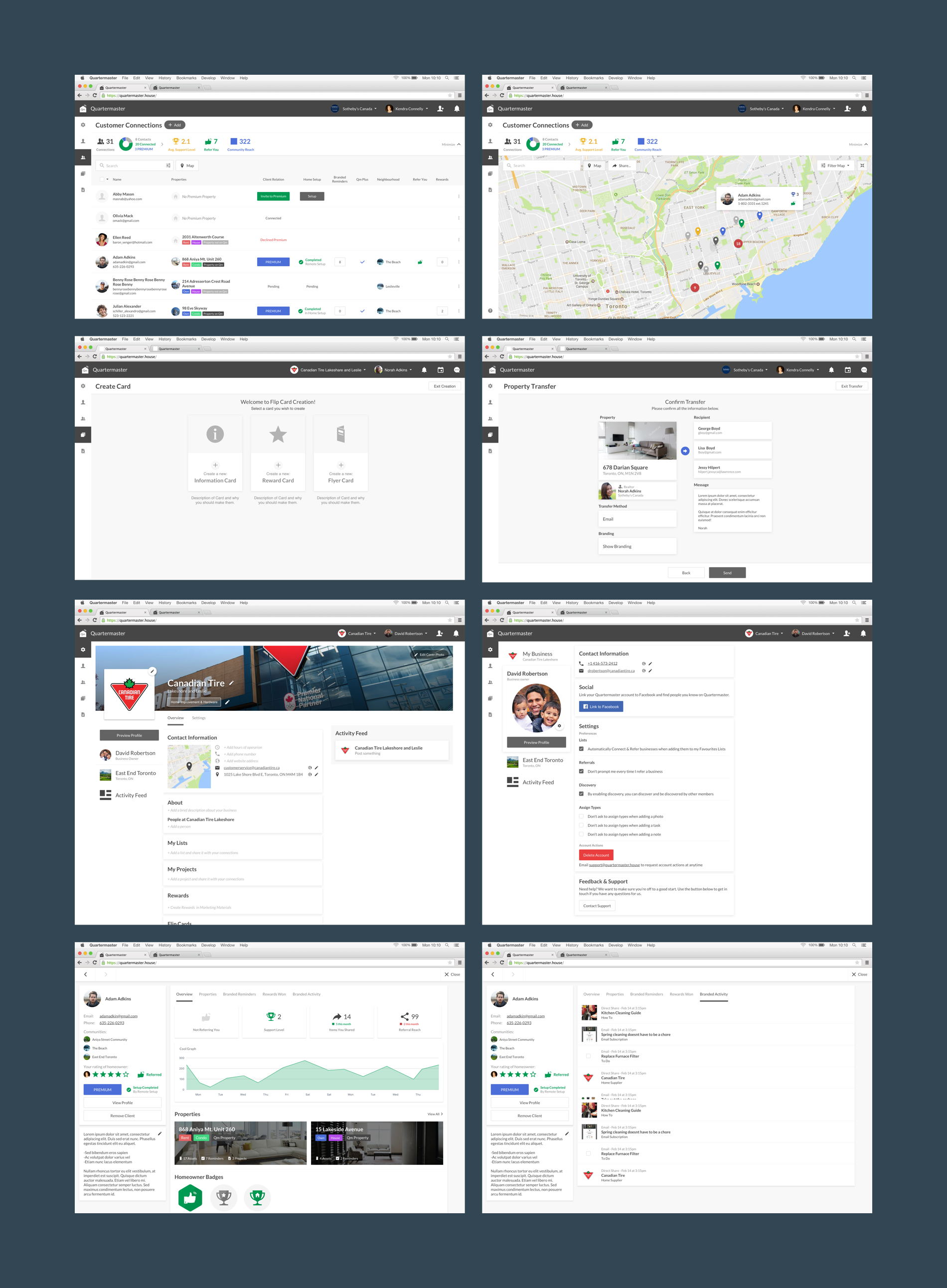
Objects on quartermaster worked differently, but shared commonalities such as tags, categories, edit and delete functions, and permission and visibility. A platform-wide card view was designed to be flexible enough to display important information about each unique item while maintaining consistency across the platform.
The card view had 3 main sections. The header contained the object type, share and permission settings, and in some cases additional information such as ownership. The body contained object specific information such as image, name, and data unique to the object such as location, date and price. Finally, the footer contained tagged objects, tagged rooms, tagged folders, and extra options such as delete and archive.
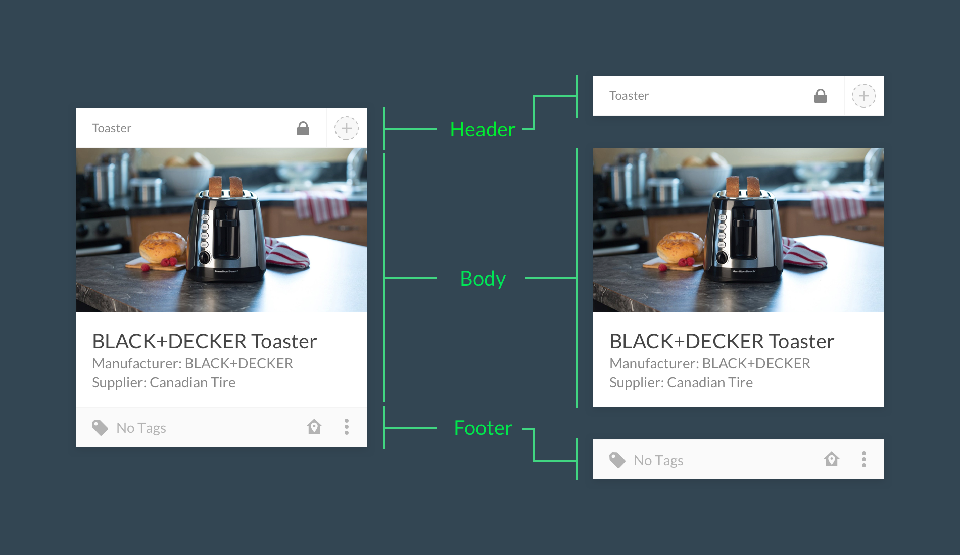
After card view was implemented across all sections, users began to find frustration in certain sections such as To Do’s and Documents, where they want to quickly view all items in a list but were unable to. A toggle between card and list view was introduced, adding more options for users to organize and sort their content. List view also needed to consider sorting by column.
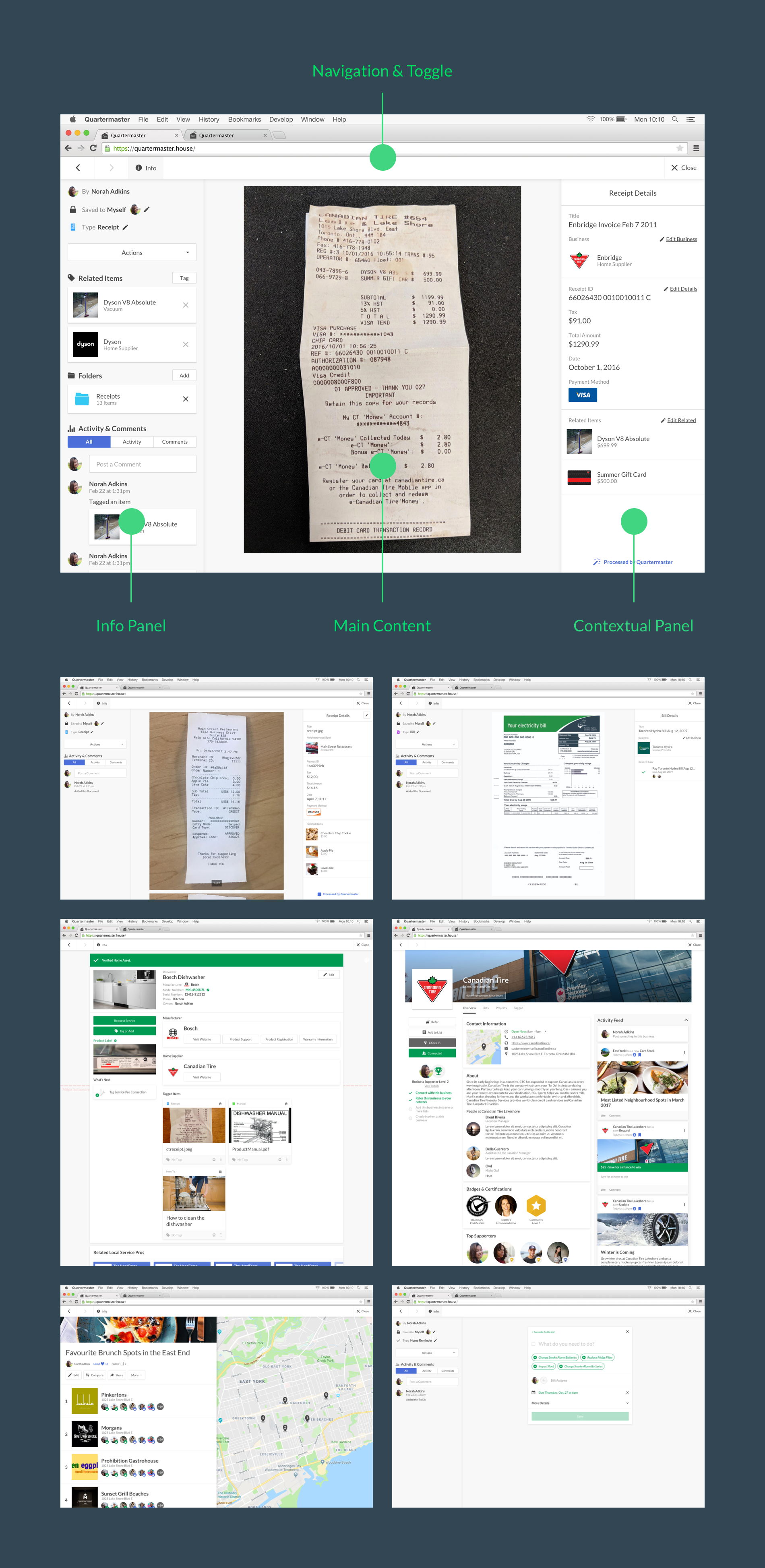
Click-In and Info Panels
Every object on Quartermaster had unique and common properties. Users needed a way to quickly view an object without losing their place in the navigation. A universal “Click-In” framework was designed to encase all objects on Quartermaster. This allowed users to view any objects on top of another allowing for easier cross navigation between items.
One functional flaw with this design was that it did not sync up with the browser’s back and forward buttons. Built-In navigation on the click-in had to be added to allow users to navigate through their path. This was fixed once each object obtained an unique URL allowing the back button to function properly.
Inside the click-in, users needed a consistent way to see common information across objects, including permissions, actions, tags and history. To accomplish this, an universal information panel was added to the left side of the click-in which can be toggled on and off. With the information panel, users could find specific information for any object on Quartermaster.
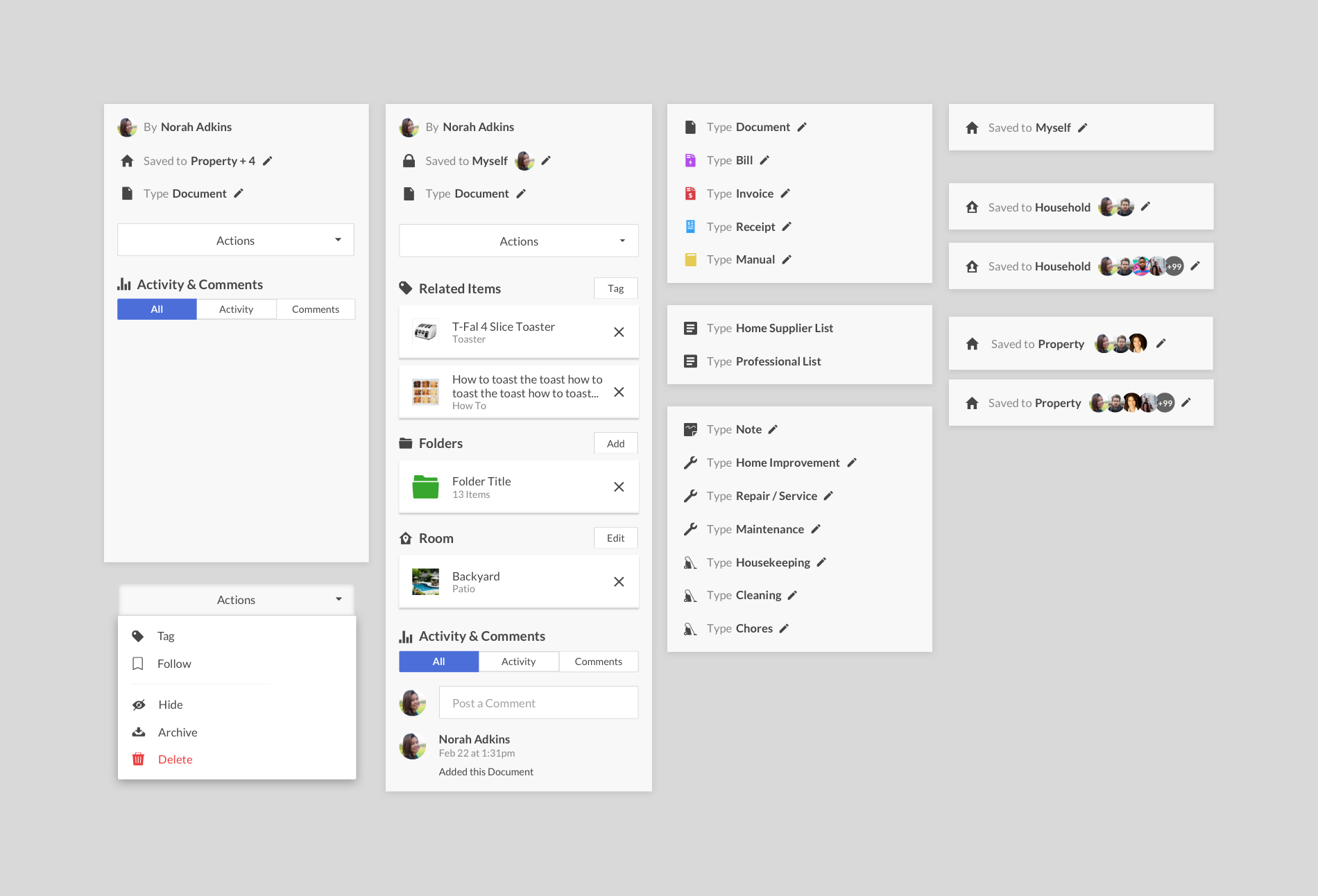
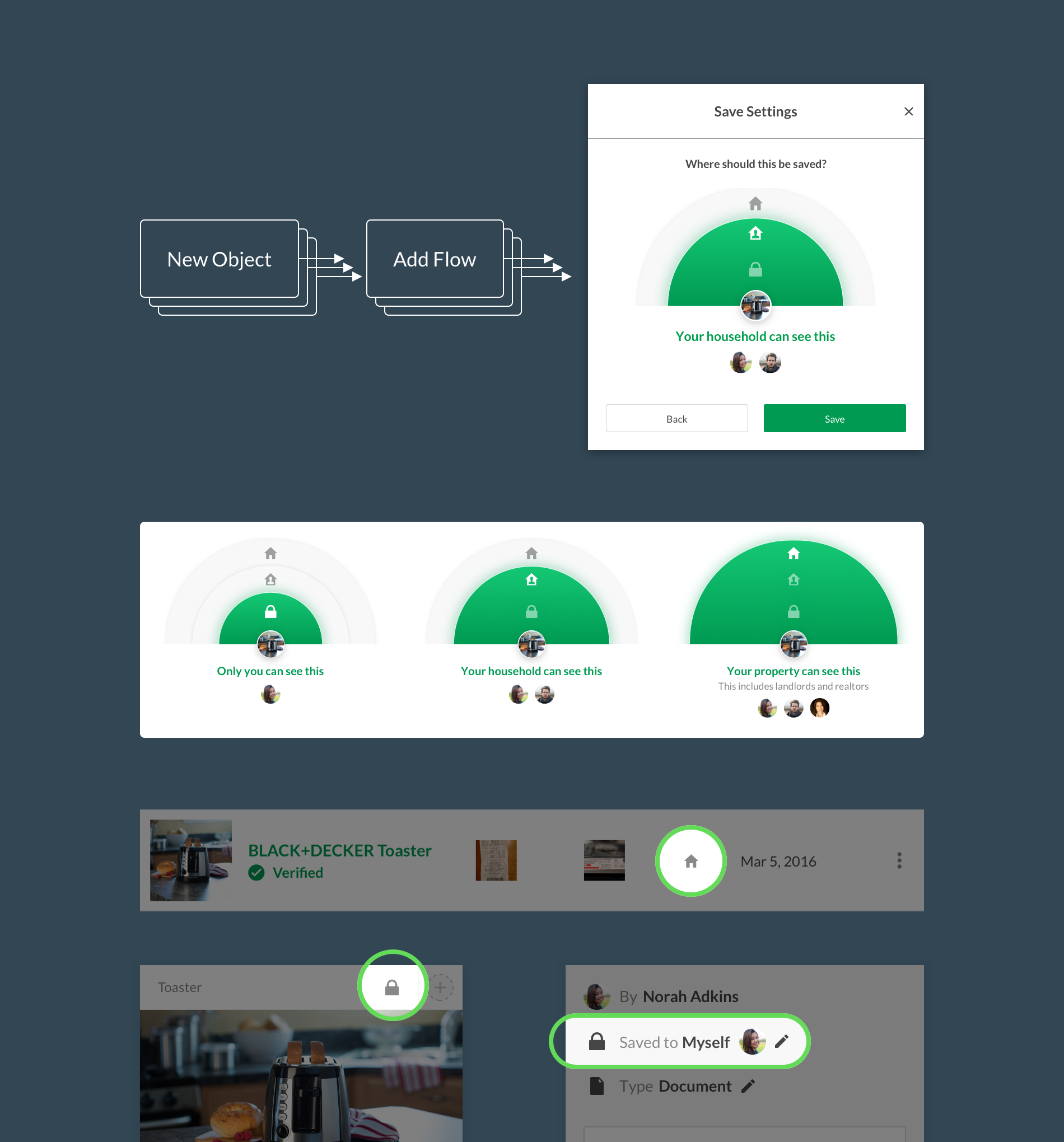
Permission & Visibility
Each object on quartermaster has permission & visibility settings. There are three levels of permission which ranged from private (just me), home only (household), and home-related individuals such as Realtors and landlords (property). New objects created or added on Quartermaster required permission. A universal modal was designed so it can be used anywhere on the platform.
Responsive Design
Quartermaster started as a web app so it needed to be responsive. Going against the traditional mobile-first approach, I started web-first and scaled down from there. The layout was contained in modules with a maximum width, and sections and layout consisted of multiple modules. This allowed a much easier transition between each breakpoint. The desktop-first approach instilled responsive thinking on each new design.
A mobile app was eventually developed. Initial designs were heavily influenced by the responsive design. Over time, more native solutions were implemented for the mobile app. Even so, the web app still needed to be responsive, so 4 web breakpoints + 2 native breakpoints needed to be considered for designs going forward. Due to limited time and resources, this was reduced to 3 web + 1 native breakpoints.
Reward System
With so many of the features being set-it-and-forget-it, we weren’t attracting many return users. This is where the reward system came in. By completing certain actions on Quartermaster, users received reward points which they can use to redeem gift cards from their favourite cafes, restaurants, or even hardware stores.
The reward system needed to be applied to almost all existing flows. Some flows were tweaked and other flows were redesigned from the ground up. Up until this point, most flows were encased in a panel to the right. Originally, this right panels allowed users to view or interact with the content on the left. We later discovered that users focused on the panel after initiating it and did not need to interact with their content while open. So all the flows from this panel turned into a modal, allowing it to be center focused and be launched from anywhere on the platform.
The number of reward points accumulated depended on the weight of the action taken. A heavier task such as adding a home asset yielded higher points than connecting with a business. Points were collected individually by each user, and could alternatively be transferred from user-to-user user-to-business through an action called High Five. This was aimed to encourage homeowners to recognize good deeds around the house by their family and roommates.
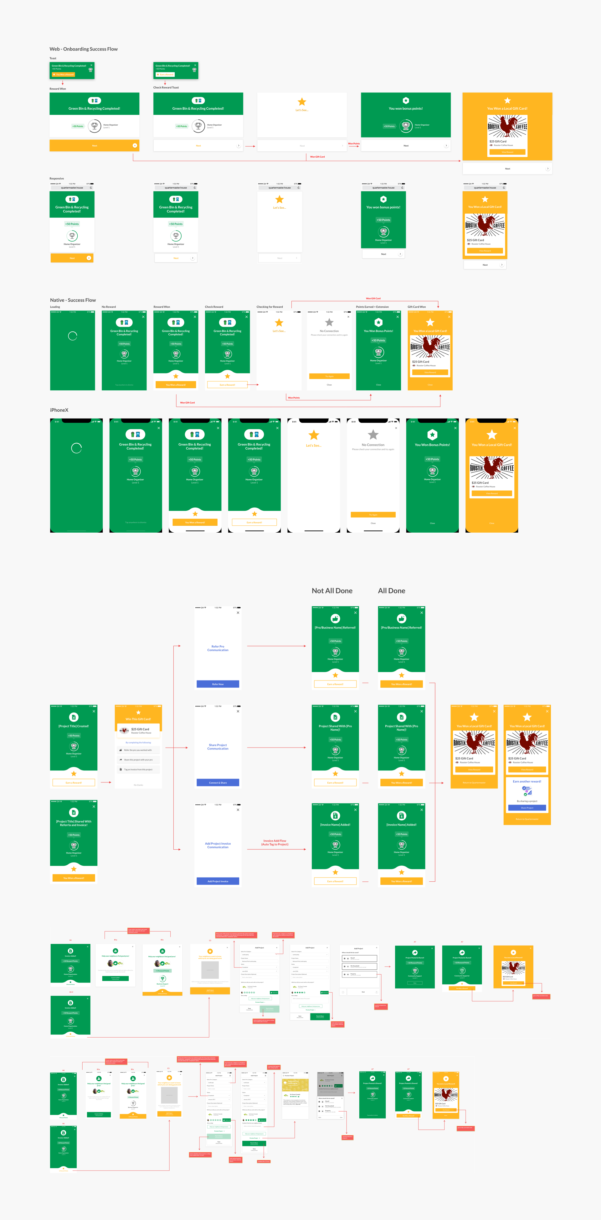
Lottie Animations
The reward system wanted to give users delight and satisfaction while on Quartermaster. Animations were used to convey this. I creates animations using After Effects and exported it to be compatible with Airbnb’s Lottie animation system.
Design System
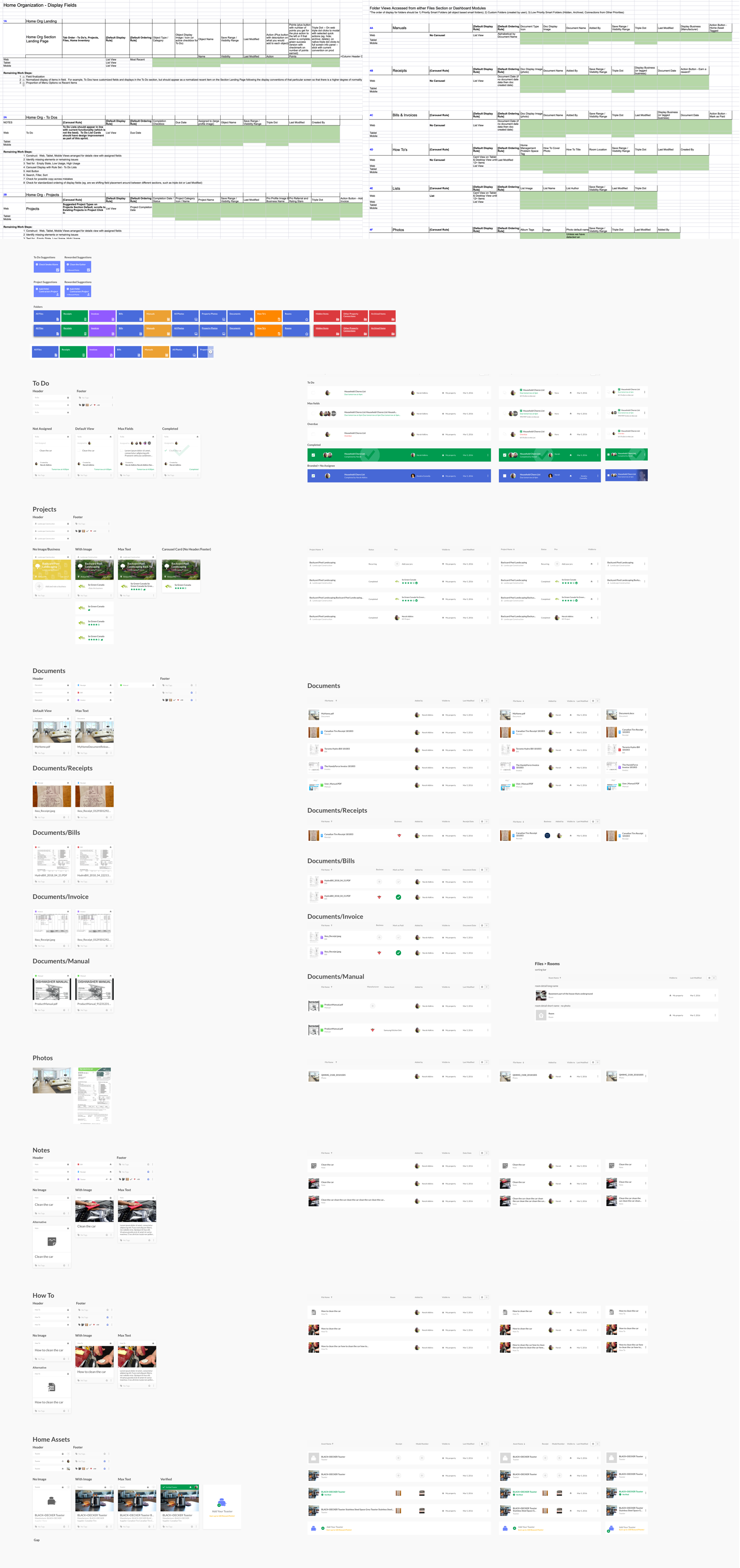
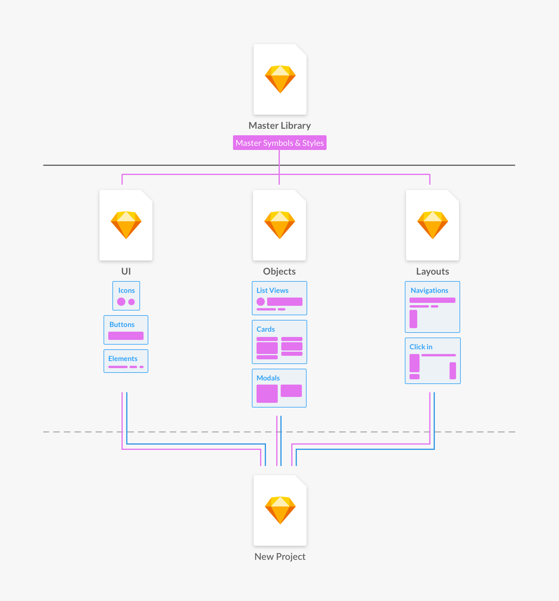
I created and maintained the design system using Sketch’s libraries feature. Due to the sheer number of symbols (1,695), styles, icons, and elements that need to be maintained, I decided to treat the master symbol file as a black box. Symbols from the master file were pulled into separate sketch files to create various states of UI elements like buttons, inputs, dropdowns, modals, cards, headers, footers, overlays, toggles, tabs, and toasts. By creating all the states, it simplified the process of finding and copying the necessary symbol into a new or existing file. This method along with the Runner plugin made the workflow a lot more efficient. Work needed to be done fast and efficiently to keep up with the fast paced nature of the company. This design system allowed us to go from whiteboarding or sketches directly into UI design and prototypes.
Prototyping & Handoff
We used the InVision platform for creating prototypes for user testing and developers handoffs. A proper handoff process was developed over the years to streamline this procedure.
Business Platform
Businesses on Quartermaster can manage their customers or clients through the business portal on Quartermaster. This included tools such as editing business details, creating flip cards (digital flyers), customer CRM, managing projects, and a planned messaging platform.
Lessons Learned
Quartermaster was quite a challenge. Every design needed to consider it’s implication within the navigation, visibility architecture, data limitations, responsiveness, usage differentiation, business app implications, and the mobile counterpart. Designing a responsive web app with so many features was especially challenging, but I learned to think about different screens and platforms when designing every aspect of the experience. I created and maintained the design system to make the visual experience and workflow more consistent and efficient. It allowed designers to quickly create high fidelity mockups quickly, saving time. Navigation and user flows changed over time through feedback, leading to improved experience and understanding of our users.
However, user retention and return rate was a challenge to maintain. Quartermaster was ambitious in it’s goal and much of the idea came from the company’s philosophy of home organization. Business objectives and technical feasibility was clear, but there was a lack of desirability. Lacking understanding of existing journeys and pain points for homeowners, Quartermaster ultimately did not solve a problem. A lot more upfront research was needed to empathize with homeowners and understand their needs in the current market.
What's Next
Being a fully self-taught designer, I felt I lacked some fundamental UX knowledge to advance my career. I decided to leave Quartermaster and attend the UX Design program at BrainStation to better understand the UX process.